

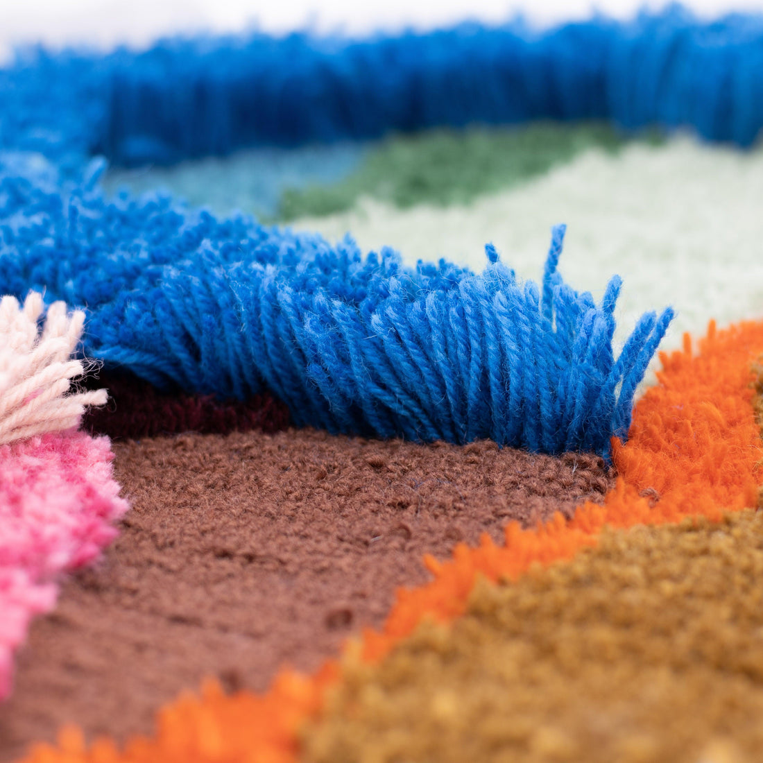
Using Color Theory in Your Tufting Projects
At Tuftingshop, we believe that color is one of the most powerful tools in an artist’s toolkit, and when it comes to tufting, it’s no different. The colors you choose can guide the viewer’s eye, create visual depth, and set the entire mood of a piece. More than just decoration, color can uplift, soothe, energize, or make a bold statement.
In this post, we’re giving you an essential guide to using color in your tufted artwork. You’ll learn the basics of color theory, how to combine colors effectively, and how to use color to shape the emotional tone of your designs.
Color Theory: The Basics
Let’s start with some fundamentals. Artists have used the color wheel for decades to better understand and combine colors. In the center of the wheel, you’ll find the primary colors: red, yellow and blue. These are the foundation of all other colors and cannot be created by mixing others.
From here, we get the secondary colors (created by mixing two primary colors):
- Green = blue + yellow
- Orange = red + yellow
- Purple = red + blue
The outer ring of the color wheel is formed by the tertiary colors (a mix of a primary + a secondary color)
The color wheel helps you:
- Find complementary colors for contrast
- Use analogous colors for harmony
- Create balanced triadic color schemes (like red–yellow–blue)

How to Combine Colors in Tufted Art
Understanding color theory is just the beginning, applying it is where the magic happens. Here are some creative and practical strategies for choosing your color palette:
1. Use Contrast for Emphasis
- High-contrast combos (like blue and orange) instantly draw attention.
- Great for focal points or bold shapes.
- Example: A red form on a beige background.
2. Go Analogous for Harmony
- These colors sit next to each other on the wheel (e.g., blue, teal, green).
- Perfect for calm, flowy, or nature-inspired designs.
- Pro tip: Use one dominant color and the others as accents.
3. Try a Triadic Color Scheme
- Choose three colors equally spaced on the wheel.
- Think purple–green–orange or red–yellow–blue.
- Balanced yet dynamic, great for playful or abstract pieces.
4. Use Neutrals to Ground Your Design
- Too many bright colors can be overwhelming.
- Add neutrals like beige, cream, grey, or off-white to balance things out.
- Bonus: They make your bright accents pop!
How Color Shapes the Feel of Your Tufted Art
Color sets the emotional tone of your work. Whether you're going for bold energy, serene calm, or vintage charm, here's how to use color to communicate that vibe:
Warm Colors = Comfort & Coziness
Think soft terracottas, honey yellows, and warm olive greens. These colors are great for homey, nostalgic pieces and designs that feel welcoming and emotionally rich.

Cool Colors = Calm & Clarity
Blues, greens, and purples evoke a sense of calm, clarity, and focus. These cool tones are ideal for tufted artworks with clean lines and a modern, minimalist feel, making them a perfect choice for bedrooms, reading nooks, or any peaceful corner of a home.

Neutral Colors = Balance & Elegance
Colors like beige, white, grey, and black can ground your design and add elegance. You can use them as backgrounds or buffers between strong colors. It's great for modern or minimalist tufted work. And don't underestimate their power! A neutral palette can still be emotionally rich!

Bright Colors = Playful and Youthful
Vivid colors like hot pink, lime green, and bright turquoise can make your work feel fun, fresh, and energetic. These colors make a bold visual impact making it perfect for youthful, pop art or graphic styles.

Muted Colors = Subtle and Dreamy
Toned-down colors like dusty rose, sage, or soft mustard can bring nostalgia, softness, or a vintage feel. They blend well together and rarely clash. It's ideal for creating a gentle, romantic look.

🎁 Surprise! Our brand-new color palettes are now available in the webshop. The best part? You can get them at a discounted price!
The Do’s and Don’ts of Color in Tufting
✅ DO:
- Start with a color palette: Stick to 3–6 main colors to keep it cohesive
- Think about the mood: Match colors to the story or emotion you want to tell
- Use neutrals wisely: They highlight your bolder colors and create balance
🚫 DON’T:
- Use too many brights: It can feel chaotic, save them for accents
- Ignore color harmony: Avoid random combinations that might clash
- Forget the background: Choose it early, it anchors the whole piece
Whether you're new to tufting or a seasoned pro, using color with intention can take your artwork to a whole new level. Now it’s your turn! Grab your yarn and make something that feels just right.